Most people who try solo ads for the first time end up feeling like they threw their money into a black hole. They buy 200 clicks, see a few subscribers trickle in, and then wonder why nobody is buying their offer. The truth is that the traffic isn’t always the problem. Usually, the issue is a landing page that wasn’t built to handle the unique nature of solo ad visitors. For example, if you send 500 clicks to a page designed for search engine traffic, you might only see a 10% opt-in rate because those visitors have much shorter attention spans than people searching on Google.
Table of Contents
The Simple Psychology Behind High-Converting Solo Ad Landing Pages
Solo ad traffic is a very specific beast. These are people who are already on someone else’s email list and clicked a link because of a curiosity-driven email. They are in a hurry and they are looking for a quick solution to a specific problem. If your page takes too long to explain what they get, they’ll leave before the second paragraph.
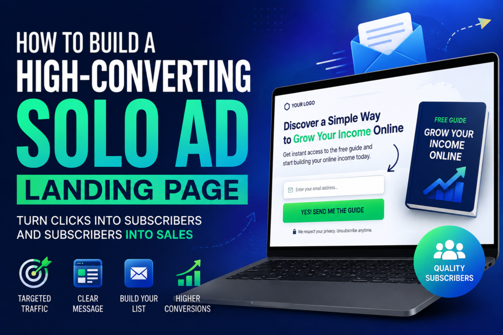
The goal isn’t to sell a product yet. The only goal is to get the email address so you can sell to them over the next few weeks. For example, a page that focuses on one single big promise and a simple opt-in box will almost always outperform a page that tries to explain three different features of a training course. You need to keep the friction as low as possible to capture that lead.
Think about the mindset of the visitor. They just clicked an email and they want to see if the page matches what the email promised. If there’s a disconnect, they’ll bounce immediately. For example, if the solo ad email promised a free checklist but your landing page talks about a 60-minute webinar, you will lose at least 30% of your potential leads due to confusion. Consistency between the ad and the page is the secret to high numbers.
Why Minimalist Design Wins Every Single Time
When it’s time to build your page, you might be tempted to use fancy graphics or background videos. This is a massive mistake in the solo ad world. Solo ad traffic is often mobile-heavy and often browsing from parts of the world where internet speeds fluctuate. A heavy page that takes four seconds to load is a page that loses money.
You want a clean, white or light-colored background with high-contrast text. This makes it easy to read on a phone screen in bright sunlight or on a desktop at night. For example, a simple squeeze page with a red headline, three black bullet points, and a yellow “Get Access” button frequently converts at over 45% for business opportunity offers. This stripped-back approach removes all distractions and forces the user to make a choice: opt in or leave.
The less the visitor has to think, the better your results will be. Don’t include navigation menus, social media links, or external blog posts on this page. For example, adding a “Follow me on Twitter” button to your landing page can decrease your conversion rate by 5% or more because you’ve given the visitor an “escape hatch” from your funnel. Keep them focused on the prize, which is the lead magnet you’re offering.
Crafting Headlines That Force People To Pay Attention
Your headline is responsible for about 80% of the heavy lifting on your landing page. If the headline doesn’t grab them in two seconds, the rest of the page doesn’t matter. It needs to be big, bold, and focused on a result. I’ve seen marketers spend days on the logo but only five minutes on the headline, and that is why they fail.
Focus on a specific benefit or a “how to” style that solves a pain point. You want to pique curiosity without being deceptive. For example, changing a generic headline like “Join My Free Newsletter” to “How I Built a $3,000 Per Month Side Hustle Using Only 20 Minutes a Day” can boost your conversion rate by double or triple. People want results, not “information” or “newsletters.”
Use power words that trigger an emotional response but stay away from things that sound too hype-filled or spammy. You have to find the balance between exciting and believable. For example, using the word “Proven” or “Simple” in a headline often increases trust enough to move a visitor from skeptical to interested. Test three different headlines with 100 clicks each to see which one resonates with the audience the vendor is providing.
The Technical Side Of Solo Ad Tracking
If you aren’t tracking your clicks, you are gambling, not marketing. You need to know exactly how many people landed on the page and how many of them actually entered their email. Without this data, you can’t tell if a vendor’s traffic is high quality or if your page just isn’t working. It’s the difference between a professional business and an expensive hobby.
I always recommend using a dedicated tracking tool to monitor your stats in real-time. For example, if you use a tool like ClickMagick to track a 200-click order, you can see if the traffic is coming from the countries you requested, like the US or UK. If a vendor promised 85% Top Tier traffic but the tracker shows only 50%, you have the evidence you need to ask for a refund or a make-good run.
You should also set up conversion pixels so your tracker knows when a visitor reaches your thank-you page. This gives you an automated opt-in percentage for every campaign you run. For example, seeing an opt-in rate of 12% on a fresh batch of traffic tells you immediately that your headline isn’t hitting the mark or the vendor’s list is cold. You need that feedback loop to survive in the paid traffic world.
Comparing High-Converting Vs Low-Converting Pages
It’s helpful to see the differences laid out clearly so you don’t fall into common traps. Many beginners try to mimic high-end corporate landing pages. That style rarely works for solo ads because the audience has a different intent. For example, a corporate page might have 1,000 words of text and five images, while a solo ad page might have 50 words and no images at all.
| Feature | High-Converting Page | Low-Converting Page |
|---|---|---|
| Load Speed | Under 1.5 seconds | Over 4 seconds |
| Form Fields | Email only (or Name + Email) | Name, Email, Phone, Income Level |
| Call To Action | Clear, high-contrast button | Small text link or dull button |
| Mobile Layout | Everything above the fold | Requires scrolling to find the form |
The differences in these small details can mean the difference between profit and loss. For example, removing the “Phone Number” field from your opt-in form can increase your conversion rate by as much as 25% because people are protective of their privacy. If you don’t absolutely need a piece of information, don’t ask for it on the first page.
The Power Of The Lead Magnet In Solo Ads
Your lead magnet is the “bribe” you give in exchange for an email address. In the solo ad niche, people want something they can consume quickly. They don’t want a 200-page eBook or a 10-part video series that takes five hours to watch. They want a “quick win” that they can look at right now.
Think about offering checklists, cheat sheets, or a short “shocking” report. These work because the perceived value is high but the time investment is low. For example, a “1-Page PDF Blueprint” for setting up an ad campaign will usually get more opt-ins than a “Comprehensive 50-Page Guide” on the same topic. Keep it simple and make it sound immediately useful.
The name of your lead magnet matters just as much as the content itself. It needs to sound like a specific tool rather than a generic collection of facts. For example, calling your lead magnet “The 5-Minute Daily Routine for New Affiliates” is much more compelling than “Tips for Success in Affiliate Marketing.” Specificity sells, especially when people are scanning pages quickly.
Optimizing For Mobile Traffic Sources
Many beginners build their landing pages on a large desktop monitor and forget that most of their traffic will come from iPhones and Android devices. Solo ad emails are frequently read while people are on the go. If your page looks messy or broken on a small screen, your money is as good as gone.
Always test your page on your own phone before you send a single click to it. Make sure the headline is readable and the “Submit” button is large enough to be tapped with a thumb. For example, if a user has to “pinch and zoom” to see your opt-in box, they will leave the page in less than three seconds. Modern builders like those found at Solo Ad Hub often have mobile-responsive templates ready to go.
Loading speed is even more critical for mobile users who might be on a weak data connection. Large images or unoptimized scripts can kill your performance. For example, a single uncompressed background image that is 2MB in size can slow your page down enough to drop your conversion rate from 40% to 15% on mobile devices. Stick to text and CSS-based buttons whenever possible to keep the file size low.
Using Social Proof Without Losing Conversions
Social proof can be a double-edged sword on a solo ad landing page. While testimonials can build trust, they can also add clutter and distract from the main goal. If you use them, they need to be short, punchy, and placed where they don’t get in the way of the headline or the opt-in form.
A single powerful quote from a real person can do more than a wall of twenty mediocre reviews. You want the visitor to feel like they are joining a group of successful people. For example, adding a small line of text below the button that says “Joined by 1,240 other ambitious marketers” can increase your opt-in rate by 3% to 7% just by creating a sense of community. It makes the visitor feel safe.
Avoid using fake testimonials or stock photos of “happy customers.” Most solo ad visitors have seen it all before and can spot a fake from a mile away. If you don’t have real testimonials yet, it’s better to have none at all than to use fake ones. For example, focusing purely on the benefit of your lead magnet is much more effective than using a generic testimonial that says “This is great!” without providing any details.
Checklist For Your High-Converting Page
- The headline is the largest text on the page and contains a specific benefit.
- The opt-in form is visible without the user having to scroll down.
- The page loads in under 2 seconds on a standard mobile connection.
- There are no external links or menus that lead away from the page.
- The button color contrasts sharply with the background (e.g., yellow on white).
- The “Privacy Policy” and “Terms” links are in the footer but don’t stand out.
- You have a tracking pixel installed to measure your results.
Once you’ve checked all these boxes, you’re ready to start testing. For example, if you run a 100-click test and your page hits a 35% opt-in rate, you have a solid foundation to start scaling up to 500 or 1,000 clicks. If you’re below 20%, you should probably tweak the headline before spending more money. This systematic approach takes the guesswork out of the process.
Common Mistakes That Kill Solo Ad Conversions
One of the biggest mistakes I see is asking for too much information too early. Every extra field you add to your form is another hurdle for the visitor to jump over. If you don’t need their phone number to deliver the lead magnet, don’t ask for it. For example, I’ve seen marketers switch from a “Name and Email” form to an “Email Only” form and see their opt-in rate jump by 10% instantly.
Another common error is using a “Confirm Your Subscription” or double opt-in process for solo ad traffic. While this can lead to a cleaner list, it usually kills your front-end conversion numbers. Solo ad leads are often impulsive. For example, if you require a double opt-in, you might lose 40% of the people who just entered their email because they never bother to go check their inbox and click the link.
Lastly, avoid the “Wall of Text.” Nobody is going to read a 1,000-word sales letter on a squeeze page for solo ads. You want bullets, white space, and a clear path to the opt-in box. For example, a page that uses three clear bullet points to describe the “3 Secrets You’ll Learn” will convert far better than three long paragraphs describing the history of your company. Keep it focused on the user’s needs, not your own story.
What To Do After They Opt In
The work doesn’t stop once you have the lead. The seconds immediately following the opt-in are the most valuable moments you have with that person. Instead of sending them to a generic “check your email” page, you should use a Bridge Page or send them straight to a low-ticket offer. This is where you can start to recoup your traffic costs.
A good Bridge Page introduces you to the subscriber and sets the stage for the emails they are about to receive. It builds a connection. For example, a 2-minute video on your thank-you page telling the subscriber what to expect next can increase the open rate of your first five emails by 20% or more. It turns a cold lead into a warm contact who recognizes your name in their crowded inbox.
If you are promoting an affiliate offer, make sure the transition is smooth. The offer should be a logical next step from the lead magnet they just grabbed. For example, if they opted in for a “Free Traffic Guide,” the offer on the next page should be a tool or training that helps them get traffic even faster. If the offer is unrelated, like a weight loss product after a marketing lead magnet, your conversion rate will be zero.
Red Flags To Watch For On Your Own Page
Sometimes you think you’ve built a masterpiece, but the data says otherwise. You have to be willing to kill your darlings and change things that aren’t working. If your conversion rate is abysmal despite having “good” traffic, the problem is likely on the page. One common red flag is a high “bounce rate” where people leave within one second of landing.
A high bounce rate usually indicates a technical issue or a massive disconnect in messaging. For example, if your tracker shows 200 clicks sent but your page analytics only shows 120 visitors, it means your page is loading so slowly that 80 people gave up before it even appeared. That is a technical red flag that requires immediate attention. You should also check if your “Submit” button is actually working on all browsers.
Another red flag is getting high opt-ins but zero clicks on your bridge page or initial emails. This could mean your lead magnet is “too good” and people feel they don’t need anything else, or it could mean your headline was deceptive. For example, if you promised a “Free $100 Gift Card” just to get an opt-in, you will have a 90% opt-in rate, but the leads will be worthless because they only care about the freebie and not your actual business. Quality matters just as much as quantity.
Conclusion
Building a high-converting landing page for solo ads is more about restraint than it is about creativity. You have to resist the urge to over-explain, over-design, or over-complicate the process. By focusing on a fast-loading, mobile-friendly layout with a curiosity-driven headline, you give yourself the best chance of turning expensive clicks into a profitable list. Remember that your only goal on this page is to get that email address so you can build a relationship through your follow-up sequence.
Successful marketers look at their landing page as a living project that they are constantly refining. You don’t just set it and forget it. You test a new headline, try a different button color, or experiment with a shorter lead magnet. For example, a small tweak like changing your button text from “Submit” to “Send Me the Secret” can result in a 15% increase in leads over a 1,000-click campaign. Those small wins add up to massive profits over time. Stay focused on the data, keep your pages simple, and always treat your traffic with respect by delivering exactly what you promised in your headline.
Frequently Asked Questions
How many clicks should I buy for my first test?
You should start with a small test of 100 to 200 clicks to see how your landing page performs. This gives you enough data to determine an opt-in rate without risking too much capital. For example, if you spend $50 on 100 clicks and get 40 subscribers, you know you have a 40% conversion rate and can safely buy more traffic. Never scale a campaign until you have these initial numbers confirmed.
What opt-in rate should I expect from solo ad traffic?
A good benchmark for a clean, simple squeeze page in the make-money-online niche is between 35% and 50%. If you are seeing rates below 25%, your headline or your page design likely needs work. For example, if a vendor sends 200 high-quality clicks and you only get 30 subscribers, the problem is almost certainly the landing page rather than the traffic quality. Aim for at least a 30% baseline before you stop tweaking.
Can I use a video on my solo ad landing page?
While videos can work, they often slow down the page and can distract the visitor from the opt-in form. If you use a video, keep it short and make sure the opt-in box is still visible above the fold. For example, a page with a 60-second “teaser” video and a prominent email form might convert at 30%, whereas the same page without the video could potentially hit 45%. Always split-test to see if the video is actually helping or hurting.
Should I ask for a name and email or just the email?
For solo ads, asking for just the email address is generally the best strategy because it reduces friction. Every extra field you add will lower your conversion rate slightly. For example, in a split test of 500 clicks, an “email only” form might generate 200 leads, while a “name and email” form might only generate 175 leads. Unless you plan on using their name heavily in your email personalization, stick to just the email.
What color should my call to action button be?
The best color is one that contrasts sharply with the rest of your page so that it stands out immediately. Yellow, orange, and red are common choices because they catch the eye against white backgrounds. For example, if your landing page is primarily blue and white, a bright orange button will likely get more clicks than a blue one. The goal is to make the next step so obvious that the visitor doesn’t have to look for it.
How long does it take to see results from a solo ad?
Solo ad traffic is almost instantaneous, meaning you will start seeing leads hit your autoresponder within minutes of the vendor starting the run. Most 100 or 200-click orders are completed within 24 to 48 hours. For example, if you buy 200 clicks on a Monday morning, you will usually have all your data and a significant portion of your new subscribers by Tuesday evening. This fast feedback loop is why many marketers prefer solo ads over slower methods like SEO.